RS
Blog on remote sensing and deep learning
This project is maintained by tam-borine
Welcome to my blog on Remote Sensing
Here I write about stuff as I pursue my dissertation on cross-region domain adaptation of flood inundation area segmentation, using SAR images from Sentinel-1 with Google Earth Engine and TensorFlow. The goal is to build a pre-trained model capable of adapting to new unseen regions and performing comparatively better on them (dataset shift problem).
Posts
- Creating problems for yourself
- Autodownload shapefiles for a Copernicus EMS event
- Training my first FCN to do semantic segmentation
- Awesome Geospatial list of tools
- Batch export to save time - GEE Python API
- The little things
- All the difference images
- The good-bad news
- The good-bad news part 2
- Curving in promising directions with TF eager execution
- New Year update
- Transpose Convolutions - a misnomer?
- Start here
- Segmentation maps
- Dealing with a class-imbalanced dataset
- Weird Result
- More segmentation maps
- Emerging from the hole after write up (with results!)
- Research Summary
- Nomination for QMRG UG Dissertation Prize
Nomination for QMRG UG Dissertation Prize
27th June 2019
I found out today that my university has nominated this project for the Quantiative Methods Research Group (QMRG) Undergraduate Dissertation Prize. Apparently it’s a national prize (I have only been nominated though, results later in the year).
But maybe it’s a sign that some people think I am plausibly good at research?
Research Summary
23rd May 2019
I think it’s about time I gave a legible summary of the key objectives, methods and results of this project as it really isn’t obvious and it might be useful for those who don’t want to read the whole paper.
Objectives:
- To develop a model that delineates flooded areas from non-flooded areas on a global image dataset.
- To naively transfer the model to perform on images from geographical regions it has not seen.
- To improve on this naive performance using domain adaptation techniques.
Methods:
- Data were Synthetic Aperture Radar (SAR) images of the globe from Sentinel-1 (ESA) and vector data from Copernicus EMS (caution: not real Ground Truth, more corroboratory, although I used them for training labels). I joined these datasets into 20,000 labelled image patches from around the world in GEE.
- Task was delineation aka semantic segmentation or pixel-wise classification of flooded areas.
- Tools included Colab and Datalab for environments, Python, Javascript, Google Earth Engine (GEE), Keras and Tensorflow.
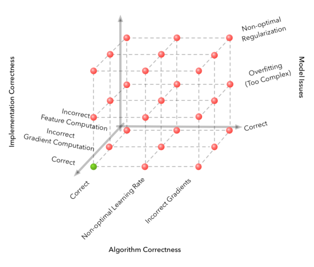
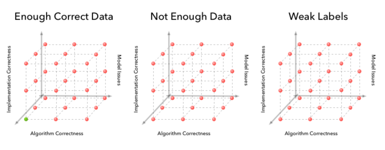
There are two main stages to our analysis. The first stage involves developing a good classifier, which-when given labelled images—will identify which pixels are flooded and which are not. This ecompases the ‘Vanilla’ and ‘Naive Transfer’ Set-Ups from Table 2. The second stage, ‘Transfer with Adaptation’ (Table 2), involves adding domain adaptation techniques to the model to reduce the dip in performance we expect from dataset shift when we apply the model to unlabelled new regions in the Naive Transfer. Just in case: dataset shift is not the same as the regular dip between training and test from the bias-variance tradeoff. The second stage depends on the results of the first stage. During the first stage we empirically discover the extent of the dataset shift problem (Objective 2).
Stage 1:
- Representation: CNN with transposed convolution
- Evaluation/Loss: softmax cross entropy
- Optimisation: mini-batch gradient descent with adam opt
Stage 2:
Augment the CNN architecture into a Mean Teacher (a variant of temporal self-ensembling)
Results
See my previous post.
Emerging from the hole after write up
20th May 2019
It has been a while since my last post, as I’ve been writing up the dissertation and submitted it and awaiting feedback. Some of the feedback I got on my draft was that it was too technical and needing to be written well enough so that others could understand it who weren’t in this very specific area. To my amazement, I put out a request on social media for interested people to give comments that would make it more readable and 5 random people got back and did this for me. I am very grateful to them for this!
Before I give you the results so far, let me tell you what’s coming up:
- I am making a research summary post here I’ll post in a couple of days, as I realise that is lacking. This will include an outline of the objectives, method and results.
- I probably going to release the thing in full as a preprint on arXiv in a week or two.
- I am planning to clean up the code and make it reproducable from the outside.
- I plan to pull in more data since a lot of floods have happened in the last 8 months since I last pulled data!
- I plan to hold out more “target” sites as then we can draw stronger conclusions.
That being said, here is the punchline I promised (this is from the conclusion, here I’ll tell you some details about the first point only as that was the bulk of the analysis):
- CNNs are capable of adapting to perform well on new, unseen regions without additional adaptation techniques, for the data and sites we tried.
- Images from different regions are likely to suffer from some covariate shift.
- Concept shift is hard to locate but may also be ameliorated with deep learning methods.
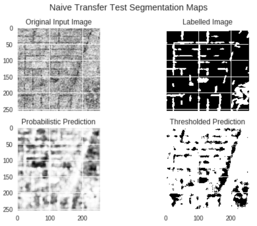
…The key findings were surprising: that there is no significant difference in classifier prediction ability between the Vanilla and the Naive Transfer set up, as measured by the F1-scores (Table 4). This removes the premise for domain adaptation…
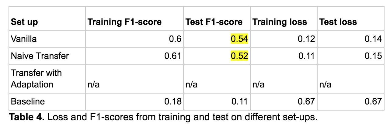
For context, the set-ups distinguish between training and testing dataset combinations. So Vanilla is when we train and test on images from source regions, Naive Transfer is when we train on source regions and test on target regions, with no added techniques, and Transfer with Adaptation is the same with added domain adaptation techniques (which we did not do in the end).
In case I hadn’t mentioned before, source and target domains are terms used in domain adaptation/transfer learning.
So that’s all for now folks, watch for a string of posts coming up including the research summary and some fun examples of dataset shift.
More segmentation maps
6th March 2019
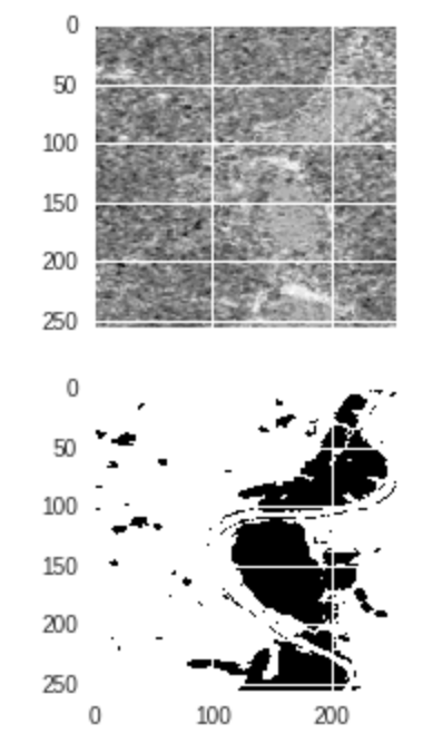
I wanted to share some segmentation maps in this interlude whilst I am writing up. I have some surprising results, but you will have to wait for those.
These maps are since fixing the weird thing mentioned in my last post (TL;DR sanity check your code). Now I am visualising the right thing :-)
Here are some interesting ones:
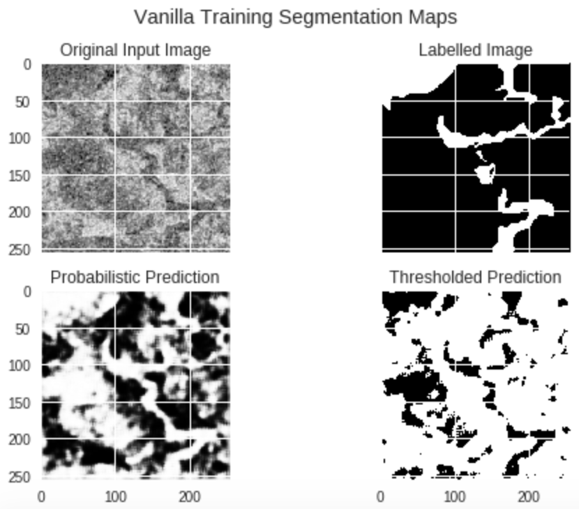
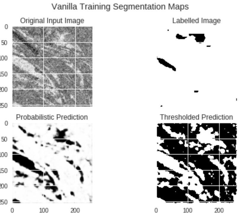
As you can see, despite poor labels we still do well.
And we can learn quite particular, different, spatial features too.
It’s worth noting that more than half the time our labels are very unrepresentative of the image, meaning the model is learning well despite lots of confusing labels. This seems good.
Weird Result
27th February 2019
So I got some results. Some good, some weird. Then I’ll tell the story of how the weird one got weird(it’s nice because there is actually a clue in the figure as to what is going wrong so you can guess before I tell you). Anyway here are some figures.
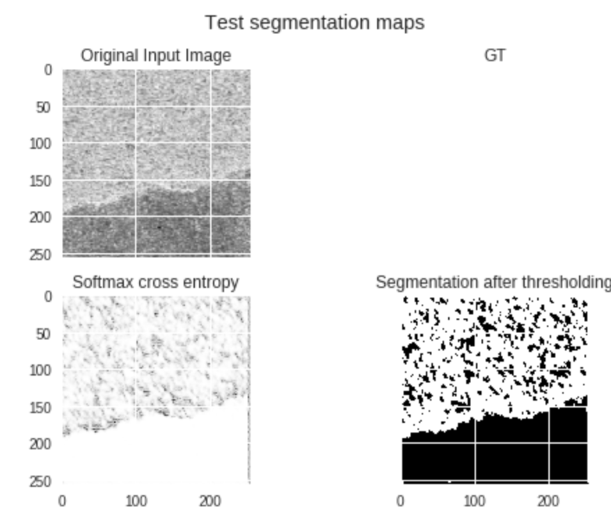
This looks pretty good, we can see even though our GT (ground truth) label is rubbish, that our predictions pick up on the features in the original input image and classify it quite well.
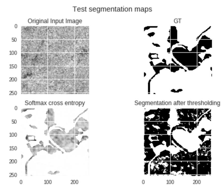
This is pretty weird and worrying. We can see here that our model has learnt to imitate the GT label and ignore the original input image, even though it has never seen this GT label before (the test dataset is for making forward passes only, so no labels are fed back and they are not given to the training set either).
My first thought on seeing this weird latter result was that we had contaminated the training data with the labels from the test data somehow. I double, nay, triple checked this wasn’t the case. And then fell into despair. Surely this was not an example of reward hacking? I guess it is plausible that the order of inputting images could somehow be gameable since due to Colab processing limits we could not shuffle with as big buffer sizes as we wanted (our datasets are large). But surely this is just too good of a gaming to get from that information… it’s just so… detailed.
Sure enough there was another silly thing I had done wrong. And the clue was staring me in the face the whole time!
Entropy. Why was I calculating the entropy and thresholding that as my predictions? Anyway, I fixed it and I do not get those weird examples anymore, yay!
So the take-away is, do sanity checks by reading over your code.
Dealing with a class-imbalanced dataset
12th February 2019
One of my big learnings was the importance of taking class-imbalanced datasets seriously, and I learnt this the hard way.
By that I mean, I seemed to be getting good accuracy in my model. But actually this metric was pretty misleading. It’s easy to learn to get 90% accuracy if 90% of your data come from one class, you simply predict that class every time. So I’ve also learnt the importance of baselines, again the hard way. Now I have a dumb model that just always guesses the most common class and I need to improve on that significantly.
I’ve also changed my accuracy metric, because the problem with plain accuracy is that it does not capture what we care about, but conflates it. We want a metric that is invariant to prevalance in the population. So I’ve switched to the F1-score for now, which is the harmonic mean of precision and recall.
Additionally it is not enough to change my accuracy measure. That is my signal, my feedback from my model. But my model needs feedback itself! That is the loss, the cost calculated each iteration from the cross entropy. By default the learning will overrely on updates gained from the most common class, so we want to downweight that and instead weight higher the gradients associated with the less common class (flooded areas) as that is what we want to learn!
To do this I simply multipled a matrix of weights in the final layer that is inversely proportional to proportion of each class. The results seem to make more sense now. Less pleasing, but more realistic, and more interpretable.
Something that’s not so obvious is where to pick the threshold between precision and recall, as it is a trade-off and problem specific. I like the diagrams on it here. Another way is to use ROC, which I may do, but one thing at a time.
Segmentation maps
31st January 2019
Just wanted to share some nice segmentation results that are popping out of my conv net. It’s so cool that this is working on my real data! For sure some of the labels are not great, but here’s a good one. Here we have in order the original image, the labelled image, and the predicted image (probabilities for classes expressed as Grayscale by the output layer of CNN).
And here is my accuracy and loss, looking reasonable. I’ve moved on to the domain adaptation part now, which is very exciting, so stay tuned for the results on them coming soon.
Start Here (or - what am I even doing?)
28th January 2019
I thought it was probably about time to add a little bit about what I am actually doing on a high level in case anybody actually looks at this blog and then wonders what I’m on about!
I understand I have given nothing in between either, no outline of my methodology or anything, more just random exclamations of weird things. But hey, you can always write to me if you want that right.
But here’s an abstract! It’s a draft, of course, I’m still writing things up (I love Overleaf). So a bit busy but will share more about results soon as that’s done. I’ll leave you on this cliffhanger - my posts might be a bit sparser whilst I write up.

Transpose Convolutions - a misnomer?
22nd January 2019
I’m implementing the final version of my CNN which is fully convolutional and inspired by the U-Net. The characteristic encoder-decoder architecture helps the problem that segmentation has (but whole-image classification does not) which is preservation of the spatial ordering of pixel values within each image, because it must be reconstructed into a segmentation map at the end.
So basically, when you do a convolution over an input image, the output map is usually of smaller dimensions. You’re capturing abstract and important features when you do this, but you are downsampling and losing resolution/ information. But because the convolution operation is discrete, if you want to reconstruct the initial image’s spatial structure, which you absolutely need to for pixel-wise prediction, you can just track the ratios of your convolution matrices transformations, and do the same things on the way up.
Transpose convolution does not undo convolution operations. Deconvolution, another synonym, is even more misleading. You will not get and inverted version of whatever you started with, at any stage. This is because the kernel weights are learned. And whatever was learnt on the way down was forgotten. So the pixel values and weights are not having any form of inversion happening, it is only the structure that is being redistributed, literally the order of the pixels. (Although skip connections might affect this).
So here’s a great and very simple short explanation of Transpose Convolution, check it out!
New Year update
13th January 2019
Ok so it’s been ages since I’ve posted and feel like it’s not fair to all my millions of readers (joke) considering so much has been going on!
Alright what’s new.
Well something massively on my attention right now is this new ML module I’ve started, which is pretty awesome. I’ve been doing linear algebra all week, which is really fun because I didn’t study math formally ever and it seems like a very useful way to think about transformations. The false Cartesian split from the OO programmer in me between functions and state has been broken forever (it was kinda wavering already from functional programming but now I’m convinced it’s better), matrices as composed transformations is just so simple. Anyway I’m not going to tell you about that now other than to say 3b1b’s videos are the best, and I also was confused when I learnt about dot product before linear eq systems and I have no idea why it’s taught in that order. I became quite opinionated about what order it made sense to understand things in this week. We had a lecture that reviewed all of lin alg in 1h (I kid not) which I only half groked. It was a review because it covered what an undergrad math, physics or maybe cs student would do over a term at least. The lecturer acknowledged this himself and said something funny like “there are two types of people in this room, people who need to know this and people who already know this, and they are both going to hate the next hour for different reasons”. Afterwards the guy sitting next to me said he did lin alg over two semesters during undergrad and that 1h covered 70% of it. Then I felt less bad about only half understanding after a week of learning.
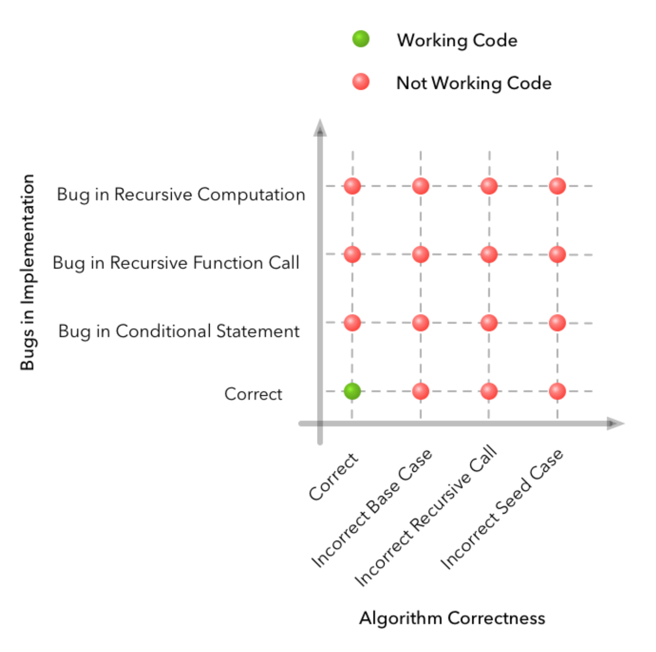
Ok enough whining about how I don’t get to do enough lin alg. Anyway theory is super helpful for my dissertation! I’ve been thinking more deeply about the bias-variance trade off lately and reflecting on my learning curves (will show some screenshots next week). I’ve also been thinking a lot after reading stuff in the paper A Few Useful Things to Know about Machine Learning that should be obvious to me by now but feels like I need to hear them 1000x (check it out). And then I also found this cool post about why debugging in machine learning is really hard compared to regular programming (spoiler: extra dimensions of error sources are the model and the data). I leave you with his awesome diagrams (from 2d bug sources generally coding to 4d with ML). Until next week!
Curving in promising directions with TF eager execution
25th November 2018
If you saw my last post, you’ll know that my loss curve was not looking too happy. I literally had to cheat, by giving the labels as an input feature, before my nueral net could figure anything out. So I did not actually find out what was going wrong (probably there were many things). I gave up and decided to use an approach that was more interrogatable and visible. I need to be able to debug and inspect properly.
TF’s new eager execution mode promised all of this and now seemed an apt opportunity to try it. So I did. Best decision ever. I also ditched TF’s high level Estimator API in favour of Keras and writing my own simple layers and training loop. Keras is so much easier to understand what’s going on and debug for me as a newb: some black boxes are too high level, others are better. I began by reading a simple tutorial, and could adapt it to my own data reasonably confidently because of the new transparency.
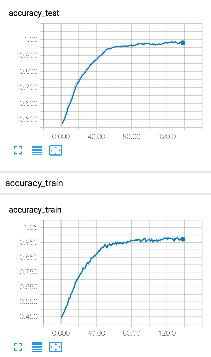
Well, it took me just a few hours to start getting accuracy that went up and loss that went down overall (albeit still very noisely - I’m working on it). Take a look!
Until next time!
The good-bad news PART 2
15th November 2018
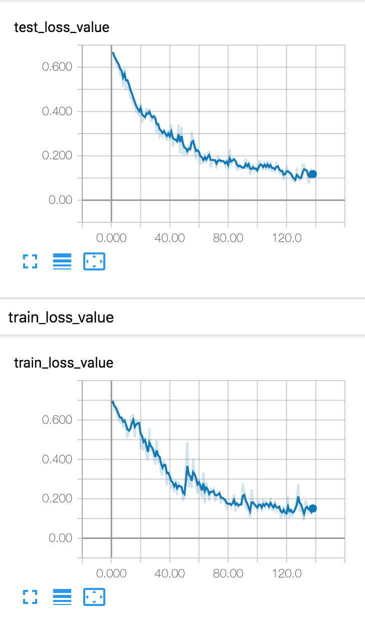
So I am finally training a simple pre canned Tensorflow estimator on my data, and I literally spent the whole day yesterday staring at wild looking loss curves with no idea what was going on. I tried tweaking params such as batch size, learning rate etc. and that did definitely change the kind of wildness, but nevertheless every loss curve was definitely not going down in the slightest, and many were not better than random chance. Take a look:
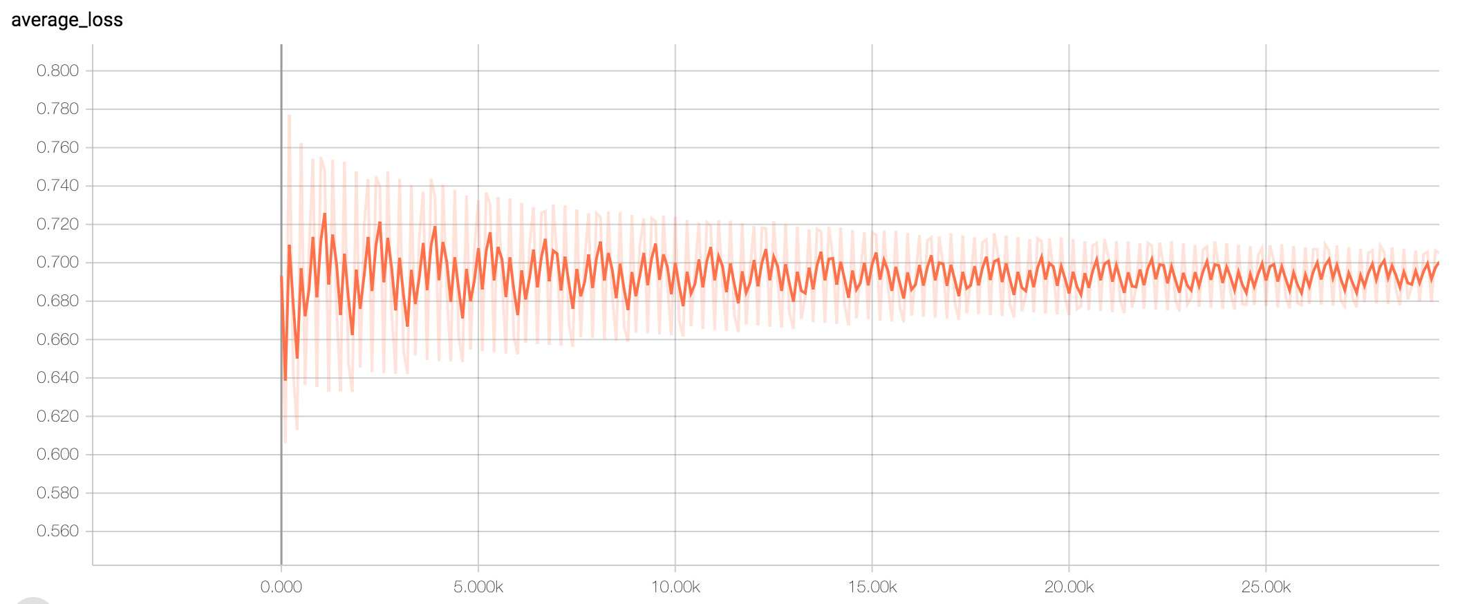
There are so many things that could be going wrong here, I could not have enough data, my model could be too complex for my data, or visa versa, there could be a bug somewhere, the spatial coordinates embedding could not be accurately capturing that feature. There is a lot to work on. But honestly because I have so little experience in deep learning, I have no intuitions for what ‘better’ looks like. They all look wild to me. Differently, but equally, wild and random. But then, my friend gave me the idea of just cheating. Ie. give the network the answer (labels) as a feature and see if it can make use of that to cheat it’s way into performing. So the good news is, I now have a lovely loss curve:
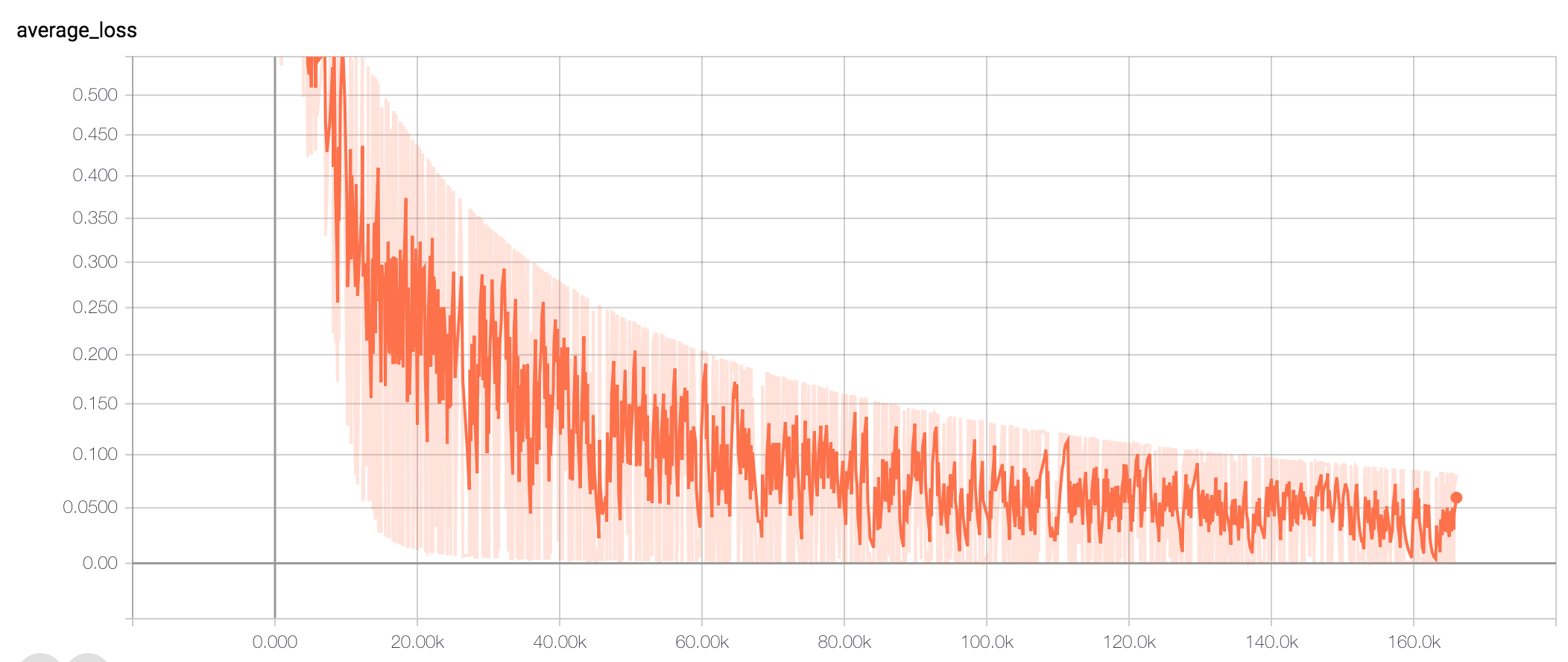
Of course the bad news is that this model is cheating as it has the answers as an input feature, so it would be very surprising if it did not find it could just win with using that feature. But at least it narrows down (maybe, I hope) the range of possible things that could be going wrong. We know the model understands it’s objective, and that it can make use of the features being inputted to it. But that’s about it.
At least I have a curve to aspire to now.
The good-bad news
10th November 2018
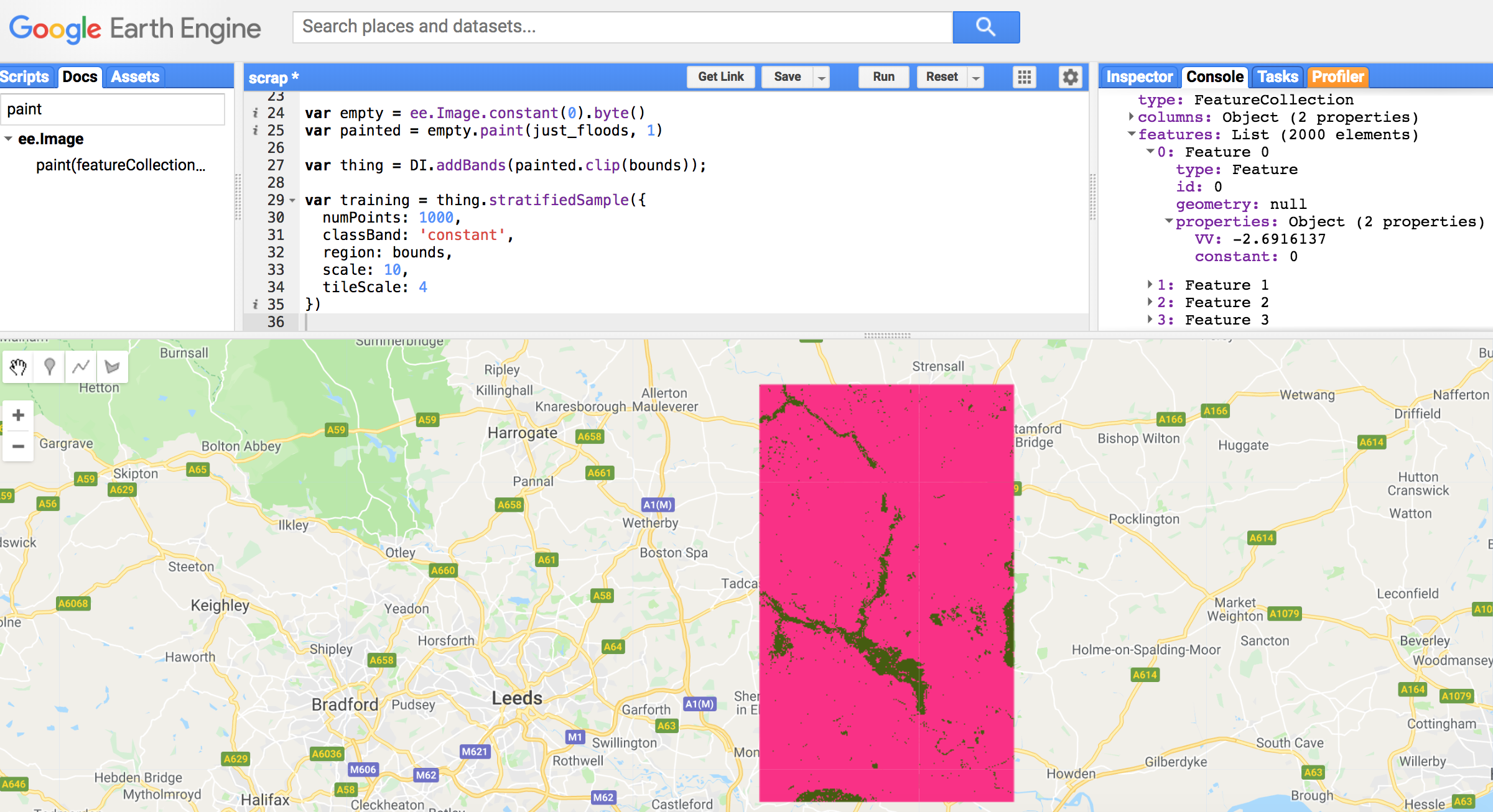
I’ve been struggling with polygons forever. It really feels that way. There was the problem that came up in the first post. And many computational limit hitting from operating on vector data. Today I decided I had had enough and was going to backthumb and try out the ‘convert my shapefiles to raster at the outset’ approach.
In hindsight, I obviously should have tried this earlier. I thought it was going to be more complicated than it was. There are some really nice simple masking and painting functions in GEE that have just made everything so much easier. It’s a little bit shocking, things are now orders of magnitude simpler and faster and I can finally be done with the preprocessing pipeline.
So the good news is I found a much simpler way that is great. The bad news is that if I’d tried this out at the beginnning (which I did actually consider briefly), I could have saved dozens of hours.
Oh well, we are where we are. Check out how simple it is:
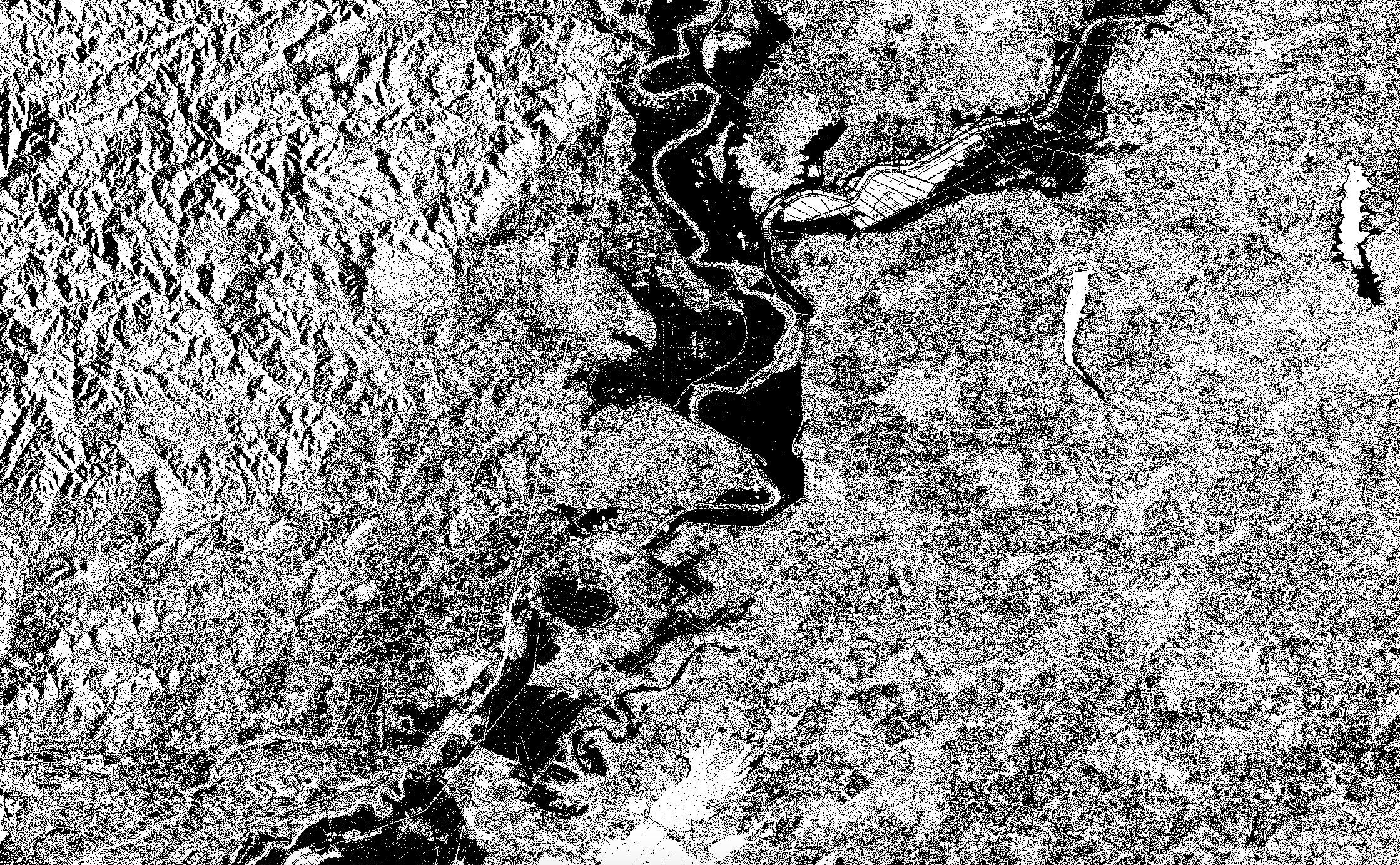
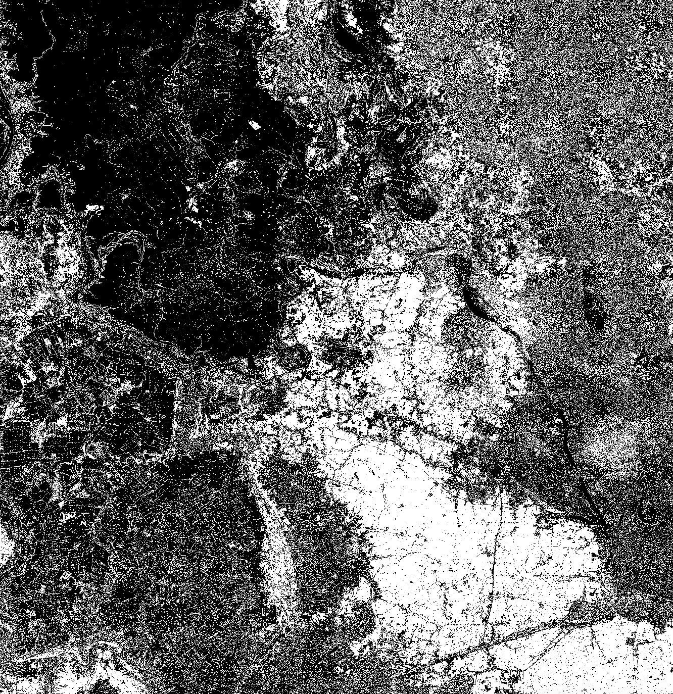
All the difference images
6th November 2018
I’ve been upscaling the preprocessing pipeline so that it’s fully automated and I can just regenerate TFRecords (the halfway checkpoint between that and my ML classification pipeline) in one go, and a bunch of stuff has occurred to me as useful that I had briefly considered but mostly glossed over in the interest of moving on.
One of these is the question of how I choose the dates for pre-flood images given that it naturally varies from region to region with their seasons and climates. The during-flood dates are easy (although still have some variation because floods occur on different durations), but I have data on when each flood occurred so at least somewhere to go from.
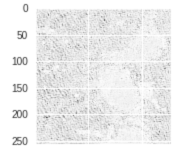
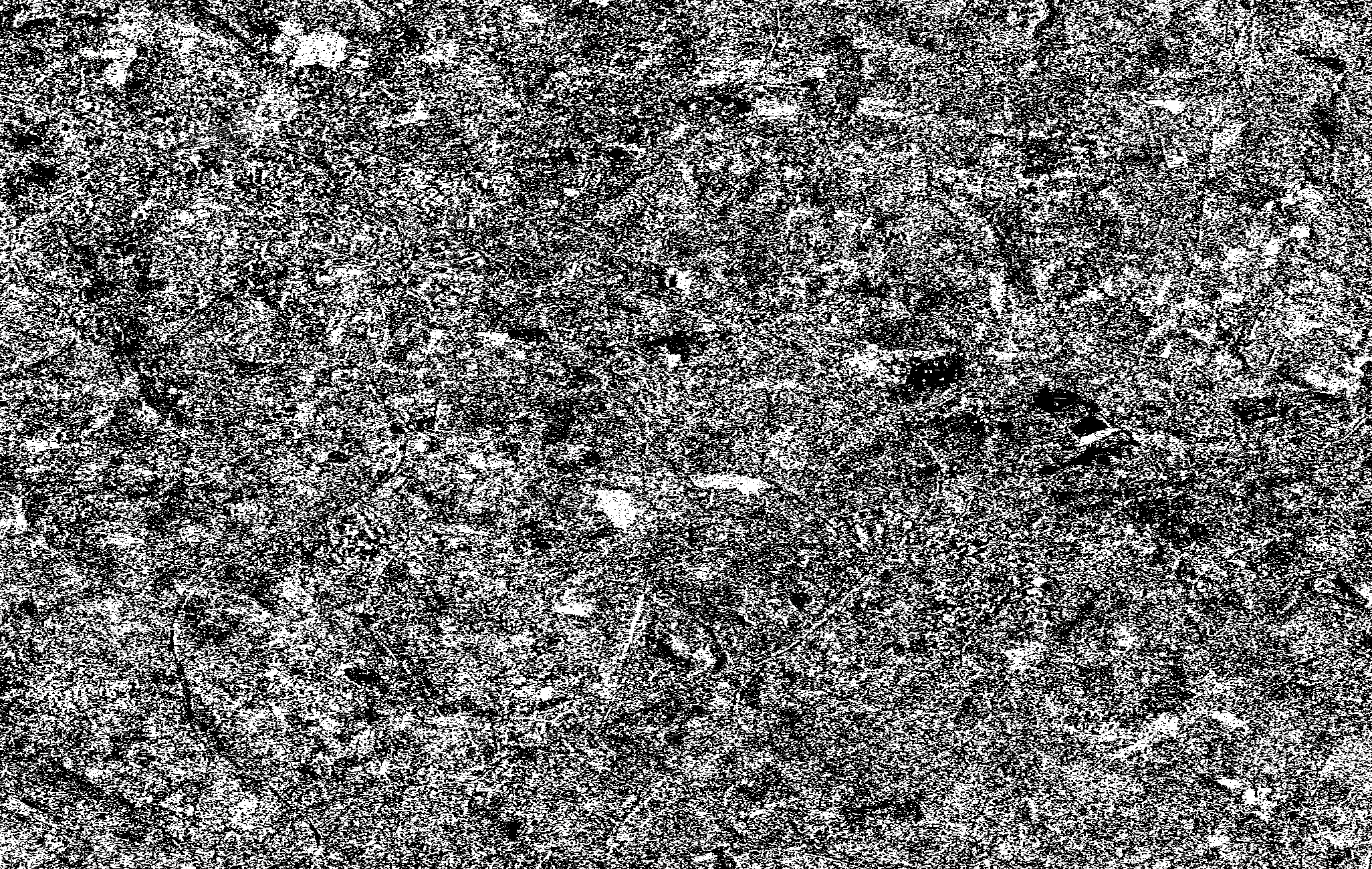
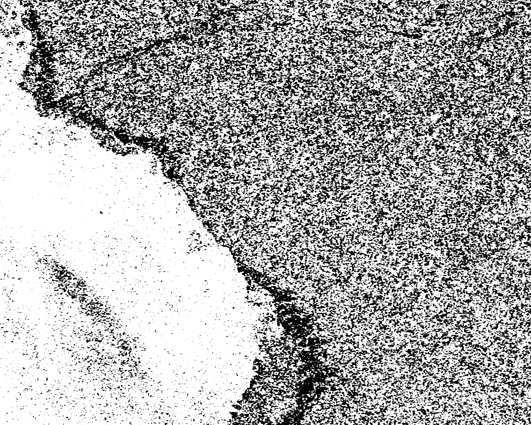
So I decided to just export a ALL THE difference images for my sites so I could visually inspect the quality of them, since for now will be the input to my classifier, it’s good to get a feel for their variation. Here are some below. As you can see the quality and obviousness of flooded area is highly variable. It is unclear whether choosing pre-flood dates better (by incorporating regional climate info) is going to help. There could be many other reasons the images that look bad have turned out that way.
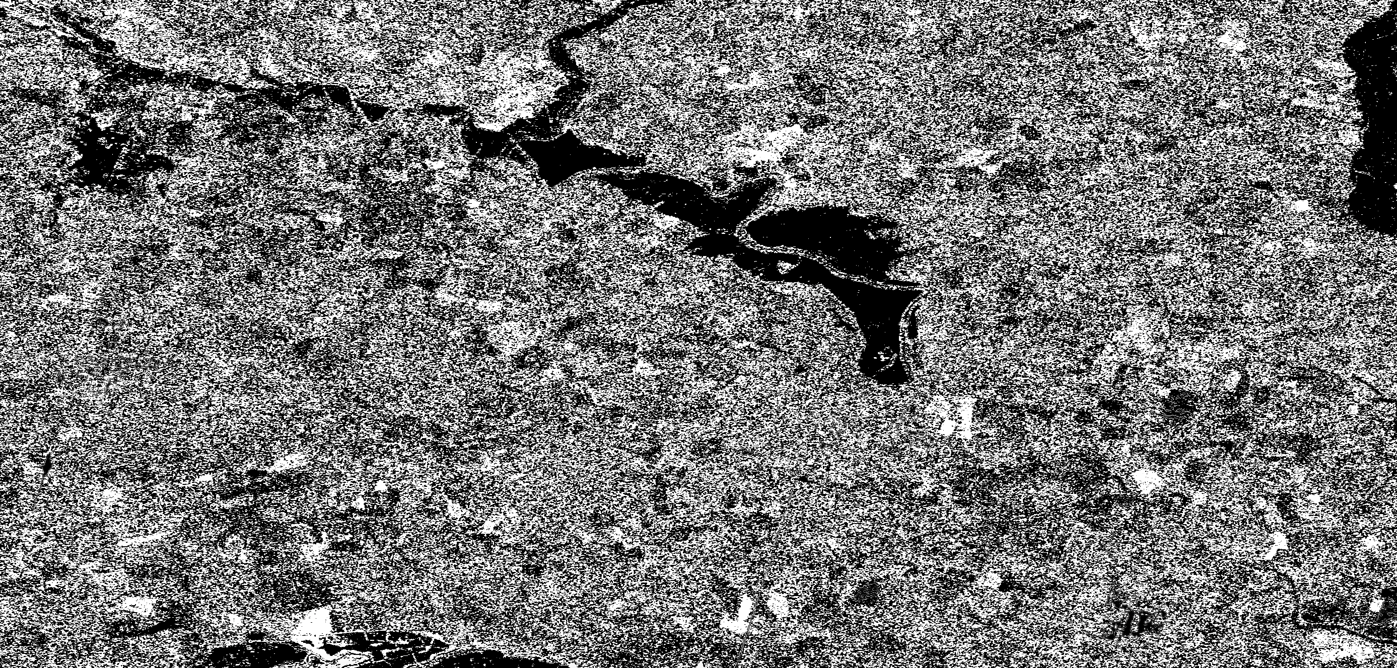
We can see that Feres and Selby turned out quite nicely. I think what we see in Yangon West, Myanmar, might be an example of my poor choice of pre-flood dates. This is because we see both a bright and a dark area that looks like part of the same flood. This would naturally happen if a big flood moved, literally causing positive change in the area it came from and negative in the area it landed in. Grile shows the coastal flood but somehow the quality is really bad and it’s unclear why. Also Leeds is extremely noisy and any signal is hard to see. And it is unclear why.
 Feres, Greece
 Yangon West, Myanmar
 Leeds, UK
 Grile, Albania
 Selby, UK
The little things (reminders of human falibility)
3rd November 2018
I just found a typo on Copernicus’ Emergency Mapping Service website. Ok big deal. I’m not writing a post about how they should get more meticulous and how shocking it is for them to have a typo. But the way I found this out was interesting, and really just reminded me how great automation is. Not just because it’s more efficient, but also because it is more repeatable and good at finding inconsistencies (like typos).
So I have some scripts that do some stuff and one just blew up trying to reconcile two lists of site names, one which was from the webpage and one taken out of the filenames themselves. It was literally one letter difference (Kyonkadun is a real place in Myanmar, Kyondadun is not…if you google them respectively you will see the only hits for the latter is Cop EMS’ webpage who originated the typo).
One character might not seem like a big deal, but it is. If a string doesn’t match, and you have something dependening on it to do so, you flip the outcomes from True to False or vice versa. That can be a big deal. One of my favourite examples of a little bug was the Y2K bug, when scientists forgot about the new milleniumm and lost over 300bn dollars.
There are definitely classes of error that are caused by the opposite, over-reliance on automation and technology, but I think on the little things humans are usually more falible. I don’t even want to re-read my blog and see how many typos I have!
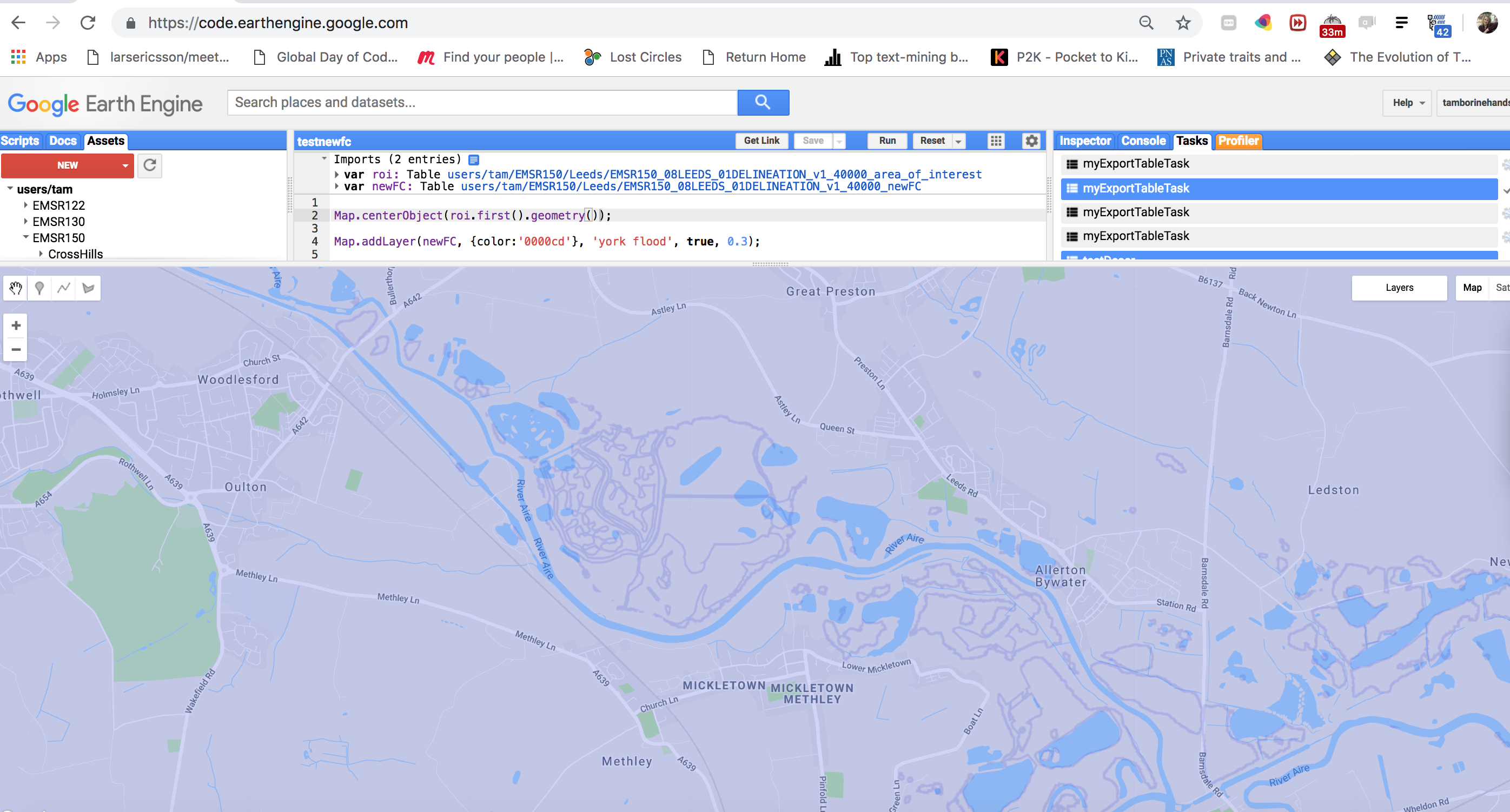
Batch export to save time - GEE Python API
25th October 2018
In my last post I was lamenting about how long some operations were taking in GEE. Saying that I needed to find other tools outside to do the job. I thought more about this and realised that not only was it the time per se that was scaring me, but the fact it was not very repeatable that concerned me most deep down. I had this little JS script doing everything: importing both vector data and S1 images, labelling, speckle filtering, doing the expensive .difference stuff, making the training set…everything. Which meant these things were not modular/small enough to A. isolate problems and B. reasonably rerun pieces of.
So I just decided to move the really time/compute costly part out and use ee.batch (for Python API only). This turned out (after some package updating stuff) to work well (see the image below of my new labelled FeatureCollection with no overlaps). It has also encouraged me to clean up my code and move it all to Python and leave JS for mostly experiments/tinkering. I think something I’ve learnt, or rather been reminded of is the KISS Principle.
Awesome Geospatial list of tools
23rd October 2018
Currently I’m trying to prepare/upscale the creation of my training set so that it is as fast as possible and easy to run. Whilst waiting for GEE to compute some stuff, I thought I’d take the opportunity to share this Awesome list of geospatial tools/resources. Awesome lists are generally awesome and exist for many things, see the Awesome List of Awesome Lists (don’t worry, it stops there, otherwise it’s starts getting a bit vacuous).
The reason I’m searching for new tools beyond GEE is because of that little problem I mentioned in my first post, about cutting out the flooded areas from the ROIs so we don’t double label. Turns out that upscaling this is really computationally costly in GEE. It seems to be mostly caused by this particular .difference operation rather than the many other things I’m doing (although I am verifying that, slowly (should have started simple and then added code rather than visa versa to test contributing compute times)).
So I’m going to probably need to do that bit outside of GEE, with some geospatial Python library or something. So now I’m checking out the options and the Awesome List is helpful. In terms of my needs. I’ll need something that can read in shapefiles. And something that can handle really complex multigeometries and cut them all out of the ROI efficiently.
Will post again with updates on this. For now, enjoy the Awesome Geospatial list!
Training my first FCN to do semantic segmentation
11th October 2018
It’s kind of astonishing when you run something and expect it to fail in a million ways but it actually just works exactly how it should. It almost never happens, so it’s actually a bit funny and confusing at first, but a welcome surprise!
I’m trying to repeat the road segmentation task using code in this tutorial as a way to practically try out the Fully Convolutional Network (FCN), a kind of CNN architecture that was introduced by Long et. al for the segmentation problem and uses inverse pooling to upsample because segmentation cares about spatial relationships unlike, say, plain image recognition.
I’m doing this because it’s all well and good reading about the different architectural possibilities, and there are so many great ones, but until you actually get some real data in and play around with the tools, it’s hard to get a feel for what actually matters and what is going to take the bulk of time to tinker with. In this case, it was just getting the data in and noticing that dependency was missing. I did it with Google Cloud Service’s storage buckets, but you can just use GDrive.
If you want to see it, here’s my notebook in action - it’s actually training right now although unlikely anyone will see this in time, and the loss is going down most epochs!
I know you might be thinking, what does roads have anything to do with flood area segmentation? Ok, I can draw some relations but none justifiably for this research. To be honest, the idea is to just get up and running with a clean dataset that has been repeated a few times with clear baselines, before opening the world of my data. If I can get a model working well on clean data, it’ll be easier to think about what is going on and have a clearer vision when swapping in my own data. I will know that the problems I encounter must be something data related, or at least data-model interaction related, as opposed to the very real possibility that I just built a crappy model for any segmentation task…even one with reasonable data.
So the idea is to really grok my model, asking the questions and making the decisions here, and play around with the architecture with this one with the clean road segmentation data and then when ready swap my data in, and make adjustments as needed.
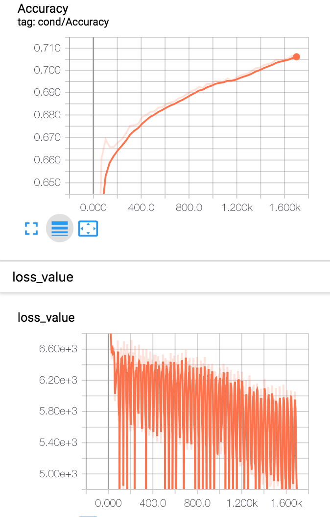
I’m on epoch 21/14 and my loss is at 2.386! But most of the updates were done during the backprop first epoch actually (loss from epoch 1 was 1299.525 and loss from epoch 2 was 6.633 (see screenshot), which is what you tend to see on a good learning curve I think. Exciting times!
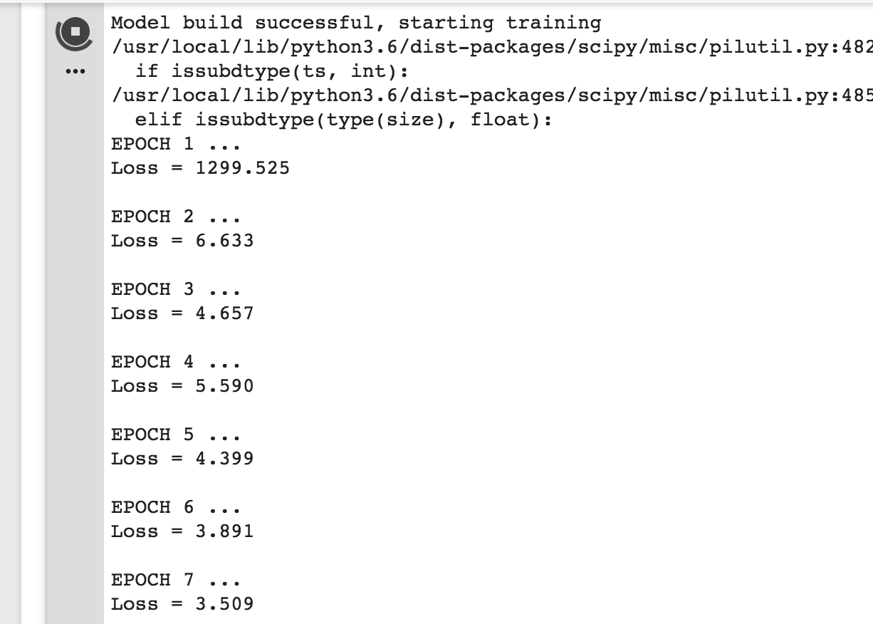
Update: There was a jump back up to 20 loss at epoch 29 but it went back down but only to ~3, which is worse than it was before whatever happened at epoch 29. This is the kind of thing that is worth investigating, and learning how to investigate now.
Autodownloading shapefiles for a Copernicus EMS event
3rd October 2018
For my ground truth dataset I am using vector data, shapefiles, of the inundation extent as mapped by Copernicus Emergency Mapping Service, which dedicated emergency service users can activate during all kinds of natural disaster events. There list of activations and associated maps are here. It is far from a complete resource, there are probably quite a few important disasters that have been missed. However, it does give us ground truth data since they use GCPs during orthorectification. Edit this is not sufficient to consitute ground truth data and will actually be data used for cross-referencing since that’s they best we can do, just ignore wherever I say GT.
Although the website is fairly intuitive for humans, unfortunately there is no way to quickly download all their data. Ideally they would have an API or bulk download options. But instead to get the shapefiles for an event I need to click on each map’s zip files, go to another page where I check a box disclaiming liability, and click another button. I figured, since I’m only going to do this once, I’ll bear the brunt and do it. I needed 1.16GB worth of maps, which took me around 2 hours to manually download.
But then, whilst filtering these locally, I accidentally deleted many of the files I needed! Because each .zip packs them up, there’s no way to re-download only the subset I had accidentally deleted, so I would have to re-download everything! The idea of this was super painful. But it was a good excuse to do what I really wanted to do, an ought to have done, from the outset: automate it!
So, there were two routes:
- see if I could just
wgetthe resources (this did not work, they’ve done some fancy thing where there servers take POSTs not GETs for the .zip folders and also need param tokens that are generated on the fly). - write some Javascript to simulate what I would be doing (you know by now this is my only option).
So guess what I did! Ok I know you just want it so here it is:
var zipClassName = 'views-field-field-component-file-vectors';

var vectorfiles = document.getElementsByClassName(zipClassName);

function initiateTimeOut(i) {
    var f = vectorfiles[i];
    var url = f.lastElementChild.firstElementChild.href;
    window.newWin = window.open(url);
    setTimeout(function() { doStuff(i,window.newWin) }, 4000);
};
function doStuff(i,win) {
    console.log(win);
    win.document.getElementById('edit-confirmation').click();
    win.document.getElementById('edit-submit').click();
    i++;
    if (i <= vectorfiles.length) {
        initiateTimeOut(i);
    }
};

initiateTimeOut(0);
If you’re wondering what’s with all these timeouts and functions calling each other. The answer is Javascript is weird. More here.
If you want to try it out:
- Go to some event, say this one http://emergency.copernicus.eu/mapping/list-of-components/EMSR130
- Right click on the page and open the browser’s developer tools
- Execute the above code (you may need to click always allow for the site as the popup blocker gets triggered in Chrome in top right hand corner - do it the first time and then repeat these steps, you won’t need to do it again)
Also, there are lots of tasks this thing could generalise to. To adapt it obviously you’ll need to change/remove the class names which are specific to this site (you can get these just from the page source) and also do the stuff you actually want to do on child windows in the doStuff function. Happy sort-of-somehow-maybe-semi-crawling!
Creating problems for yourself
17th September 2018
So I have been having some problems trying to create a training dataset in Google Earth Engine recently and thought it would be funny to share them.
I had no idea how to do this but I knew what output I wanted. Roughly something which had for every pixel in my region of interest (roi) a label of either ‘flooded’ or ‘non-flooded’, whilst keeping the image’s main data (backscatter coeffcient in this case, since it’s SAR). This would be stored in some appropriate data structure, which I could then export to use in Python with TF.
I found this nice little script from GEE’s Earth Engine User Summit 2018, which I missed, which showed a straightforward way to do this.
Essentially:
- You have some Image(s)
- You have some FeatureCollection(s) which have the labels on their properties.
- You want some structure that pairs these to create a training/test dataset for ML. Turns out
.sampleRegions()does this.
Here’s how they did it (the undefined variables were defined earlier in the script just including relevant stuff only):
var newfc = urban.merge(vegetation).merge(water);

var bands = ['B2', 'B3', 'B4', 'B5', 'B6', 'B7'];

var training = image.select(bands).sampleRegions({
  collection: newfc,
  properties: ['landcover'],
  scale: 30
}).randomColumn();
So sampleRegions only takes one FeatureCollection (FC) which should have all the labels, for all the classes. Since I started off with two FCs, one of the whole area, which by default is unflooded, and one of the flooded area, which is a much more complicated GeometryCollection - we need to merge them. My naive approach was just to use .merge, but then I realised there was a problem of spatial overlap. How would any classification algorithm know which label is right for a pixel that is on an overlapped area which has a Feature of class ‘flooded’ and also a Feature of class ‘non-flooded’? Is this representation even possible? Hopefully not as it’s nonsensical! I concluded I couldn’t give such a FC to sampleRegions. I had to somehow “cut out” the flooded FC from the non-flooded one, and then merge the resulting FC with the flooded one. I stumbled quite a bit trying to do this, thankfully got help from the GEE community on StackExchange.
The answer was to use .difference on the .geometry() of the complicated, flooded, FC. The main “problem” here was that my geometry object was super complicated, with many MultiGeometry and GeometryCollection subobjects. I kept getting server side timeouts and memory exceeded errors when trying to print the results. Eventually I thought, if GEE can’t handle this, and this is only a tiny subset of the data for which I need to do this operation on, how am I ever going to get a training set? Well, as any software developer knows: when it seems tough, you just make it simpler. So I created a toy polygon called bounds and then limited the size of the complicated FC so that it had far fewer ee.Geometry objects.
var fc = ee.FeatureCollection(table).filterBounds(bounds);

var updatedRoi = roi.map(addNonFloodedClassLabels);
var updatedFc = fc.map(addFloodedClassLabels);

var diff = ee.Feature(updatedRoi.first()).difference(updatedFc.geometry(10), 10)

var mergedFC = updatedFc.merge(diff)
This worked! Horray! But now, how was I ever going to do it with reasonably sized data. I was tinkering around, gradually increases the size of these new bounds, when I realised that it was computing just fine, just taking a really long time! This made me think that the printing was actually the problem. Maybe the server side stuff was working and the data was processed, but just printing it here on the client was too computationally costly. In which case, maybe I don’t need to worry too much just yet. I poked around and sure enough in the documentation there is information about the unique client-server dynamic of GEE.
On the upside, now I know that maybe computational problems are just a result of me trying to fetch massive results, but that things actually just worked sitting somewhere on the back end. On the downside, how do I get visibility into this?
I moved on, and tried to shove my mergedFC into .sampleRegions(). Again, I was hit with a computational error. Couldn’t print the training data, exceeded 5000 elements or something. I checked the example code again. Why did they have the same amount of dimensions as their input FC? How did they keep the output dimensions so small? Turned out to be an obvious reason, they were using just a few labelled points whereas my labelled input FC, mergedFC, was many polgons covering many pixels. I discovered this by arbitrarily playing around with the scale param, I found when I increased it then the number of output dimensions was lower and if I made it very high, like 300, it was under 5000 - yay! However, SAR pixel spacing is 10m, not 300, and I don’t want to lose information!
What to do? Well - I don’t exactly know, I’m starting to think that the computational limits I am hitting are just the client side fetching ones, and that under the hood things are being processed fine. I took out Profiler. Kept getting this cryptic process called (plumbing) at the top of my sorted usage list :/.
Looking at the Debugging guide GEE give, it seems Export might be handy. So I’ll try that next I think.
But something I learnt from all of this was that things that seem like problems are necessarily exactly the problems you think. Something could be going fine, but the real question becomes how do I get visibility into this? How much visibility is enough, what is it I need to ensure? And how do I ensure I am being as efficient as possible and not doing stupid things?
These questions are not rhetorical, please message me!